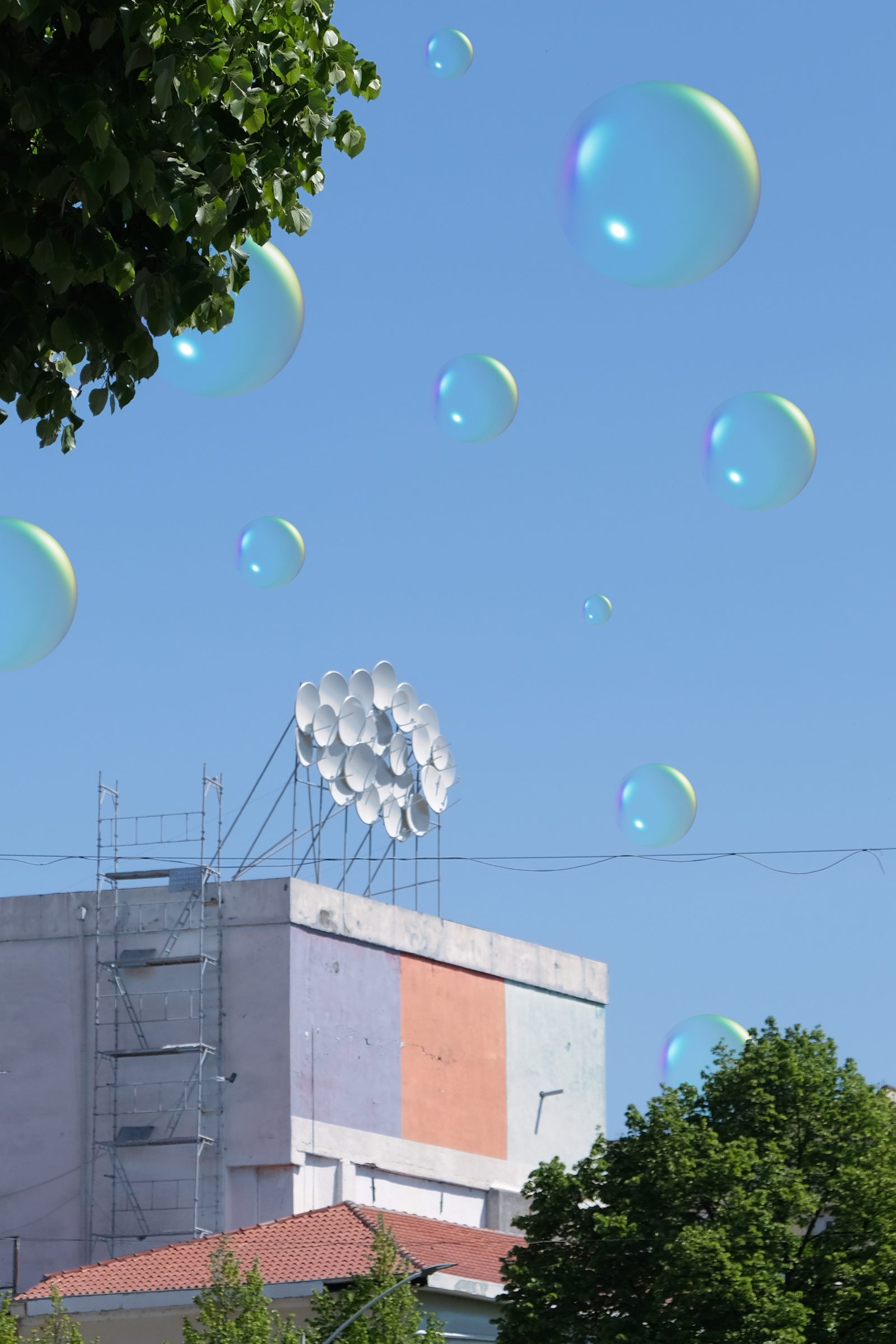
Frutiger Aero is an aesthetic that’s taking the internet (and my feed) by storm (or by light showers, I can’t tell at the moment.) Chronologically occurring after Y2K, the Frutiger Aero aesthetic is characterised by a lot of nature, clear water, bright colours and a glossy sheen on top of everything. Oh, also everything is kind of three-dimensional in terms of design. You see, Frutiger Aero was one of those aesthetics that was designed by and for technology – with the name actually being a combination of the UI design name for Windows Vista and Frutiger (the font). Perhaps the most clear example of Frutiger Aero is the Windows background – with the hills – and the accompanying start-up music.
Significantly, Frutiger Aero was used by a lot of tech companies to create a more easy-going and comforting atmosphere through the interface of the technology that they were trying to sell. Much of the Frutiger Aero aesthetic was used and popularised through device-scapes (I just created this word) such as the Nintendo Wii menu, Xbox menu, Playstation Portable (the entire device itself actually), and early iPhone app designs. While it can be seen here and there in other media, it just was not used a lot in media content and culture – because it was mainly a design-related marketing tool. It was an aesthetic designed to ease people into a high-tech world whilst reassuring them that it would not really alter our natural world.
I think our nostalgia for this aesthetic says a lot about our current mindset. The Frutiger Aero era (say that 10 times in a row) represented a time of sheer positivity for a utopian world where a large amount of technological developments could co-exist with nature that would be completely unscathed as a result. It’s very clearly an aesthetic that intends to create a cross-over between ecological concerns and technology; suggesting that perhaps both can and will create a better world together. Nature here refers to actual nature (like trees, etc.) but also humanity. We are simply nostalgic for an era where we felt on top of the world, with a bright outlook on our technological advancements being used to further the planet. And we are nostalgic for that, well, because it’s fictional. It never happened.
What concerns me the most about Frutiger Aero, is that it is so clearly a marketing tool (it always was) that is now being potentially used in city planning. I feel like this aesthetic is kind of making a comeback in terms of visuals and mock-ups for smart cities that a lot of cities are trying to create. It’s an image that tries to suggest that unparalleled levels of digitalisation and nature preservation can co-exist. However, we all know very well that technology is just not enough to save our planet, there has to be initiative. So, while it’s all fine and dandy to try and bring back that optimism, it has to be pragmatically based in reality. So, just being in a building with a lot of trees and technological elements (like self-service machines, etc. ) means absolutely nothing unless there’s actual work being done on an institutional level for technology to aid the environment (and humanity).
So, point is, it’s important to not let our nostalgia cloud us from the fact that Frutiger Aero as an aesthetic is as corporate as it gets, and will (and is in my opinion) being used to sell an idea for a green future that can exist with technology (with vague year milestones such as 2030 goals or something). However, these milestones are starting to feel as fictional as the aesthetic, and unless we see an actual manifestation of the ideologies behind Frutiger Aero; the aesthetic will never be enough for a future where the damage from climate is reversed (or at least softened). You can live in a Frutiger Aero world in your imagination, but when the time comes, and there are massive destructive snowstorms; visions of a balanced world will feel tasteless and upsetting rather than nostalgic.
Written By: Mayra Nassef
Edited By: Nimrat Kaur
Visuals By: Aniela Jewtuch


